Gallery
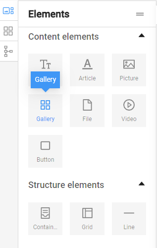
The "Gallery" element is used to insert multiple images into web pages. This element allows users to add multiple photos, illustrations, logos, and other visual elements to the web page, enabling them to be edited and arranged in groups on the page.
To use the element, click on it and, while holding down the left mouse button, drag it to the desired location on the page.
.
After dragging the element to the desired location, it appears as follows:
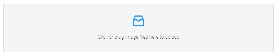
Add a gallery image
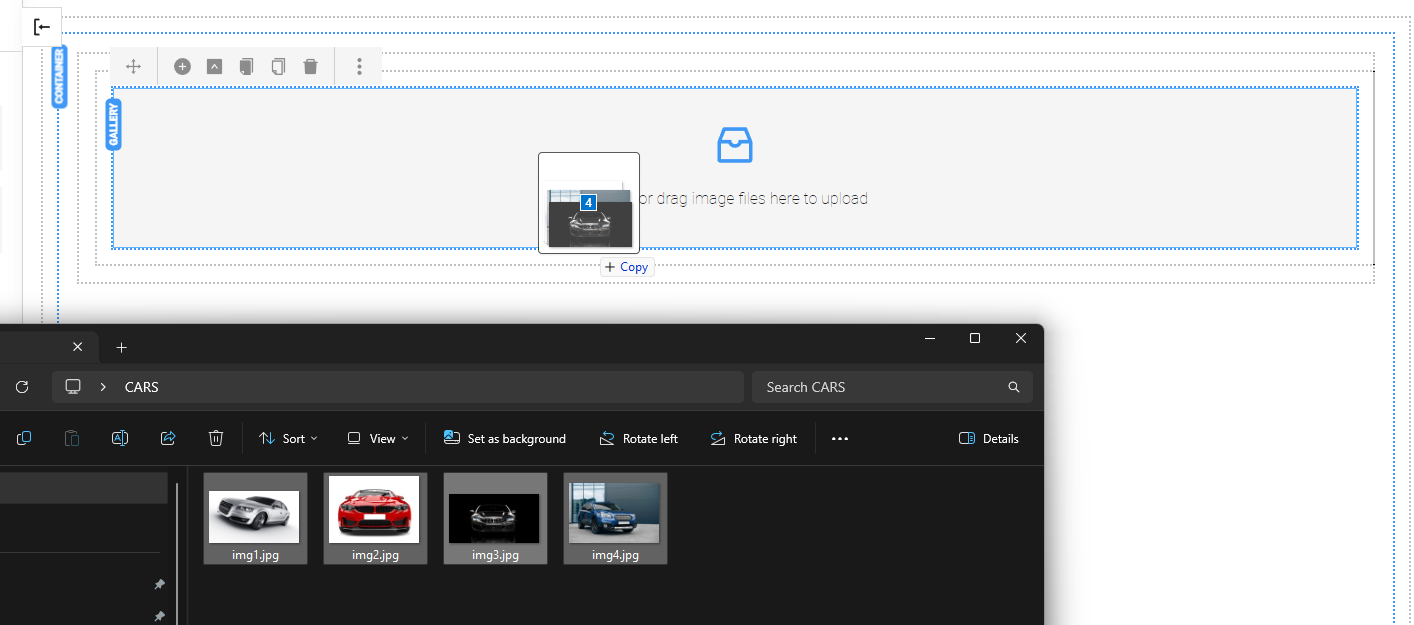
- A group of images can be directly added by dragging and dropping the files into the area of the "Gallery" element.
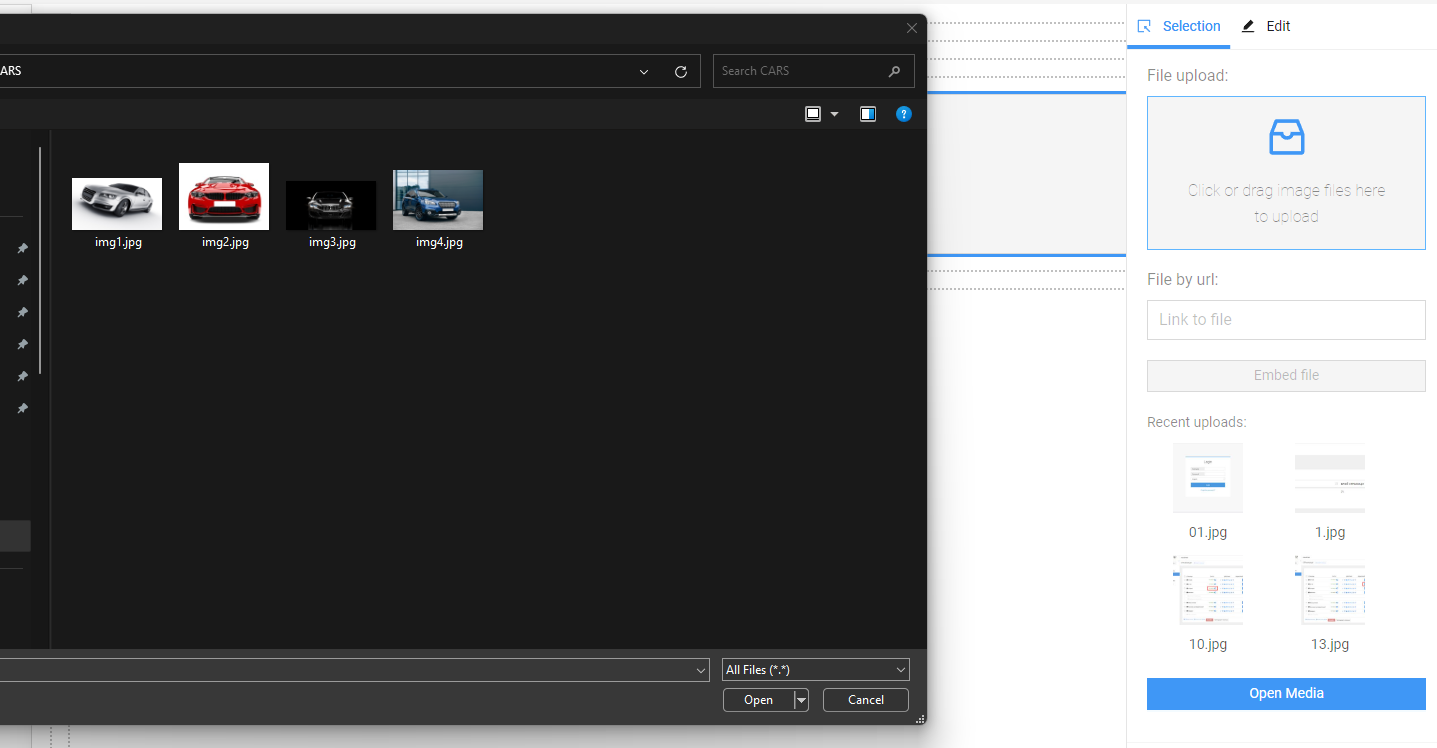
- Another option is to double-click the element to open the settings window and select and upload the images from the computer files.
- It is also possible to link to an image published elsewhere by filling in the link in the "File by url:" field.
- To add an image that is already uploaded to the website, it can be selected from "Recent uploads" or from the media folders, which can be accessed through the blue "Open Media" button.
The images are already in the gallery. Editing options are opened by double-clicking.
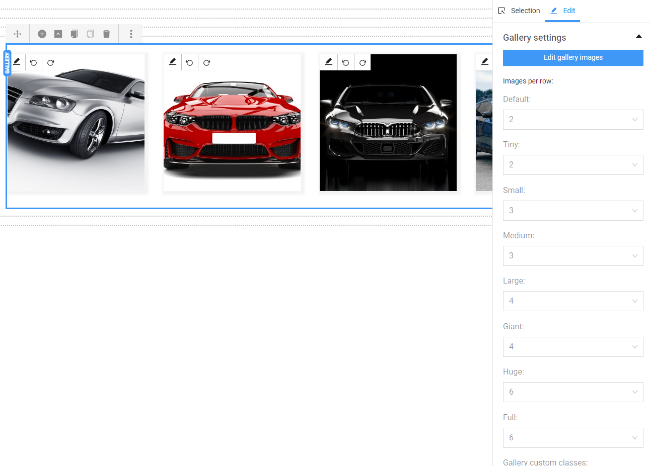
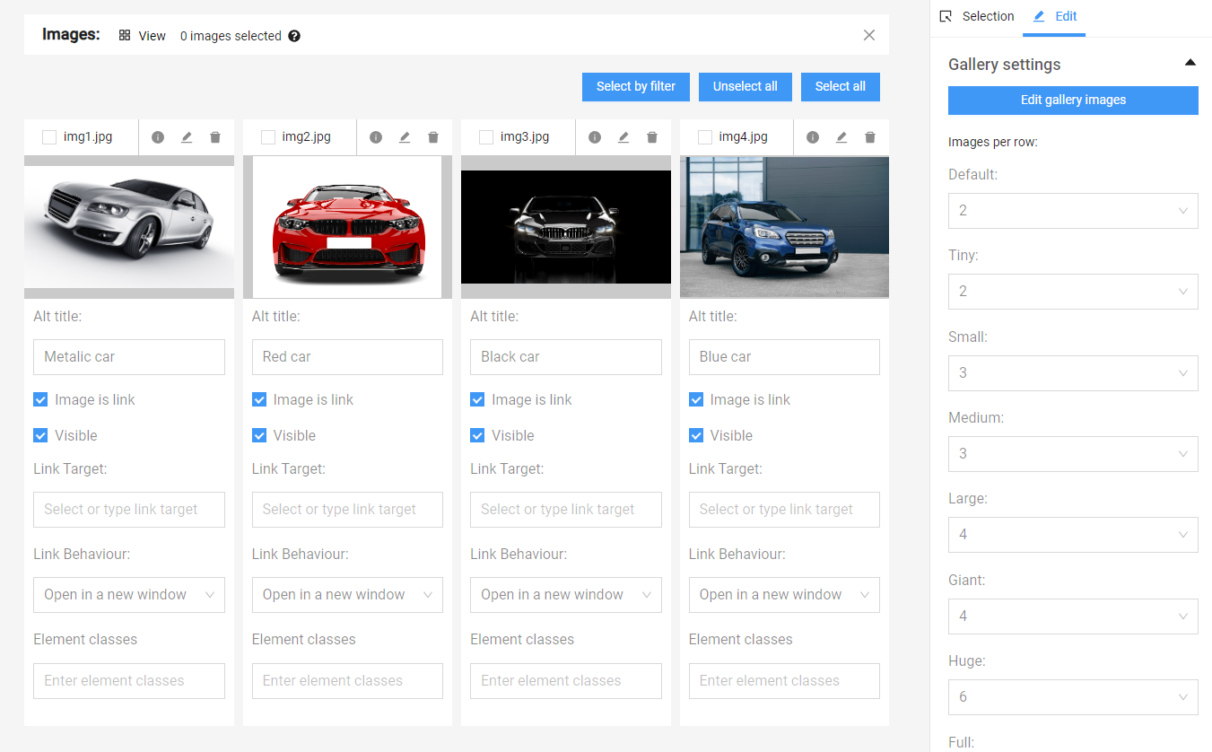
Edit gallery images - a new window opens, showing all the images that are part of the gallery, and below them, there are properties whose values can be changed. From this window, images can be deleted (using the trash icon) and rearranged by dragging and dropping.
Alt title - alternative titles for the images. By default, they are initially filled with the names of the uploaded files. It should be directly related to what the image itself depicts. Proper use of alternative titles helps with better accessibility, SEO optimization, and improving the user experience of the website.
Image is link - if selected, a hyperlink can be placed, and the image can become a link to another address when clicked. The link is filled in the Link Target field, and it can be a link to a page on the site or to an external resource.
Link Behavior - indicates where the link should open - here, the options are: in the same page, in a new window, in the parent frame, or in the full window.
Visible - if the checkbox is not checked, the image will be part of the gallery and will be visible from the admin panel but will not be visible on the website.
More options
Editing Multiple Images - this is done by checking the desired images, and to select all, there is a "Select all" button. Similarly, to deselect all, there is an "Unselect all" option.
Simultaneous Application of the Same Changes - a property can be edited simultaneously for all selected images. This is done by clicking the small blue icon next to the property name after making the change. The filled value or changed option is then transferred (copied) to the remaining selected images.
Number of images in one row
In addition to options for editing properties of individual or groups of images, there are also fields that affect the gallery as a whole. They are located below the "Edit gallery images" button in the "Edit" section. From the menu on the right under "Gallery settings," there are available values for the number of images in the gallery per row for various types of resolutions.
For mobile devices (phones and tablets), they are:
- Default (up to 479 px);
- Tiny (480 px – 639 px);
- Small (640 px – 759 px);
- Medium (760 px – 991 px);
For large tablets and desktop computers:
- Large (992 px – 1199 px);
- Giant (1200 px – 1363 px);
- Huge (1364 px – 1519 px);
- Full (from 1520 px and above).
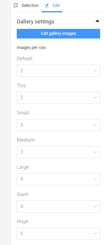
To display images well according to the width of the screen, it's good to consider how many images should be arranged per row for optimal visibility taking into account their size too. Generally, for mobile phones, it's advisable to set 1 or 2 per row, as having more may cause them to shrink too small and not display well. For wider screens, more images per row can be arranged since there's more space available.
More settings
Resize method - allows selecting and resizing the images to arbitrary dimensions (Size) or resizing while maintaining the aspect ratio (Aspect Ratio). By default, the images in the gallery are cropped to squares with a ratio of 1:1, but another aspect ratio can also be selected.
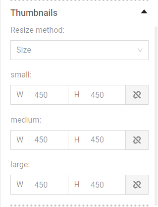
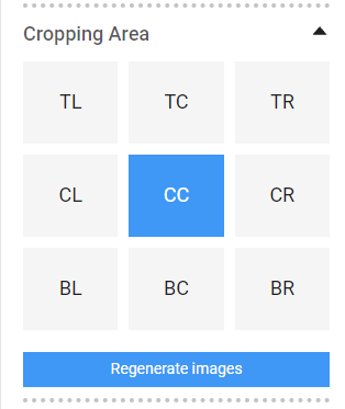
Cropping Area - Images in the gallery can be resized. Different areas for automatic cropping of the images can be selected here. The default area is the central one - CC (center center), but other cropping options are also available: TL (top left), TC (top center), TR (top right), CL (center left), CR (center right), BL (bottom left), BC (bottom center), BR (bottom right).
Regenerate images - With this button, the image can be reverted to its original size uploaded into the system.
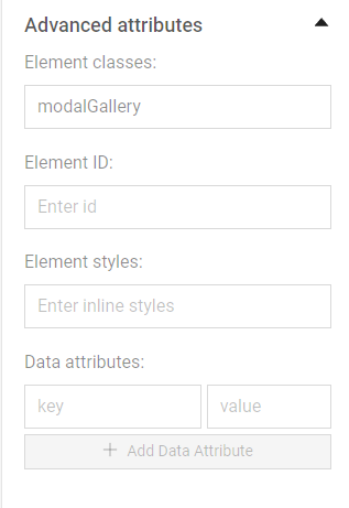
Advanced attributes - include adding classes, IDs, styles, attributes. They are used rarely and it is recommended to consult with the web developer for their usage.
Open an image in lightbox
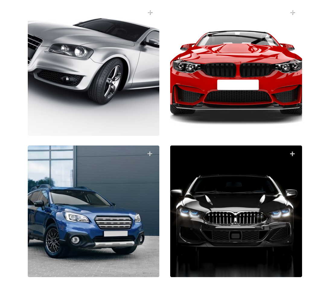
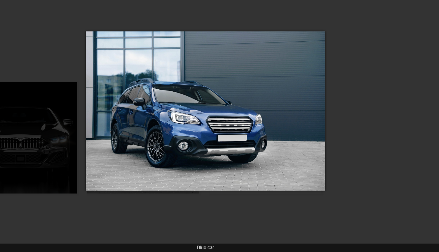
The plus icon on the image indicates that clicking on the image will open it in lightbox mode (modal window) - where the selected image is displayed in full size on a slightly transparent background in the same page. In this mode, you can navigate through other images in the gallery by using the left arrow (for the next image) or the right arrow (for the previous image).
Note: The mode is active by default as long as the "Image is link" option is checked.
